What if: A web font for data
Alphanumeric data works well for programmatic query, but less so for direct human consumption. What if a font was designed specifically with life sciences data in mind?
As EMBL-EBI’s web design architect, I help foster community standards for how services enable user tasks with consistently and predictably.
Within the standards is a mix: things found on most websites — menus, accordions, layout, messaging, branding — plus application interactivity and data visualisation standards. It’s a hugely broad undertaking with complex technical implications.
But, one of the biggest challenges is also the simplest: text readability.
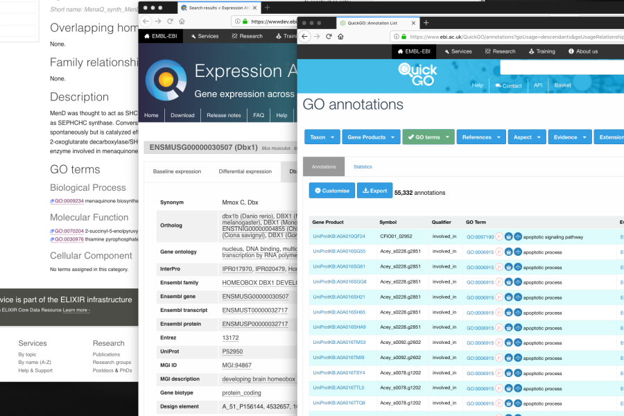
EMBL-EBI helps enable free access to massive amounts of data from life science experiments. This allows users to access lots and lots of tables with data identifiers that look like:
ENSMUST00000032717 ENSMUSG00000030507, andA_51_P156144, 4532657, 10563797, 129205_at, 4947113, 4910838, 1457012_at, 4962225, 5549684, 5020471, 4460390
Making these strings more understandable is partly a classic design problem of when, where and how these strings are presented.
But it’s also a question of what is displayed.
Problems to address
Here’s a starting list (ideas? comment? 🐦 @khawkins98):
- Multiple sequential numbers: it’s not uncommon to have 7 zeros
20000001in a row. Oh wait, that was only 6 zeros. - Readability:
Distracing_under_scoresBuMpy caPitiLiSation- Dropping descenders in letters like these:
jJlpP - Small openings (counters) in numbers at small sizes
- Wide widths of monospacing: monospaced fonts are often not used as they can take up more room (particularly with spaces between words) and folks want to pack as much data as they can into one screen.
- Monospaced = false
- Monospaced = true
A parallel in code fonts
Take computer code: monospaced fonts are an immense help. Uniform character alignment makes it easier to navigate and compare parallel rows of commands.
It’s much akin to how spreadsheets are good for lining up grids of numbers.
Monospace fonts typically have sharp, angular edges. This helps prevents mixups of a lowercase l and a pipe | or a number one 1. Likewise for an uppercase O and numeric zero 0.
You might call some of these monospace fonts “code” fonts.
Aside: There are also “duospace” fonts that combine the discernibility of mono fonts, but with flexibility for letters like w and m
Code fonts 2.0
Further illustrating the potential of modern font usage across the desktop and web, the concept of ligatures has emerged for monospaced code fonts.
Take the font Fria Code, it improves the readability of common code expressions and strings:
- != -> !=
- www -> www
- *** -> ***
- ?= -> ?=
These ligatures help with visual smoothness, readability and discernments of repetitive characters (i.e. ** vs ***)
There is some controversy about how adding ligatures can dilute truth when syntax is gospel but, in general, the trend of code ligatures shows potential. It’s still fairly new, first appearing in earnest in 2015 and you can now easily graft programming ligatures onto many monospaced fonts.
Aside There are also math fonts, but those are designed to facilitate characters that aren’t easy to represent in ASCII, which is a different problem than the one we’re looking to address here (as most of the data we’re dealing with has ASCII representations)
Why fonts matter for life science data
I’ve been talking about possible solutions to programming issues. It doesn’t fully map to the issues in data design, much less Life Science data but we can still draw inspiration from the solutions being worked on in the programming space.
To venn:

11 Tools and approaches we could use
A non-exclusive list, but some good places to look along with a few illustrative examples. I'm not saying all of these are good ideas, but they're possibilities that address some issue and this is my my way of airing everything. Oh, these are not technical demonstrations, only illustrations.
1. Monospace fonts
Just using monospace could be a big win. With the extra readability of the letter forms we could save space by reducing the font size ever so slightly.
See the Pen A data font: Monospace fonts by Ken Hawkins (@khawkins98) on CodePen.
2. Duospace fonts
Here I've used iA Writer Duospace to illustrate how we can bend the rules of monospaced fonts for better readability.
See the Pen A data font: duospace by Ken Hawkins (@khawkins98) on CodePen.
3. Ligatures
Particularly for grouping repeating numbers ever so slightly in the manner of www vs www. This one currently makes me nauseous.
See the Pen A data font: ligatures by Ken Hawkins (@khawkins98) on CodePen.
4. Ink traps
Bringing ink traps to the digital world could help for small text on HiDPI (retina) screens.
See the Pen A data font: Ink traps by Ken Hawkins (@khawkins98) on CodePen.
Second line is Retina MicroPlus and shown as SVG for licensing reasons.
5. Avoid descenders
We could avoid descenders for j and similar. This is a similar readability case as lining vs old style figures.
See the Pen A data font: small descenders by Ken Hawkins (@khawkins98) on CodePen.
6. Being width conscious
With a narrow monospace font 1 2 3; or follow the lead of duospace fonts and narrow the width of the space between words by 50%
See the Pen A data font: Width conscious by Ken Hawkins (@khawkins98) on CodePen.
7. A mild-serif monospace for legibility
It's hard to be enthusiastic about this idea, but serifs on a monospaced font at small sizes might help readability on HiDPI screens. There are a few options 1 2 3
See the Pen A data font: serif monospaced font by Ken Hawkins (@khawkins98) on CodePen.
8. Ordinal position highlighting
We could highlight every Nth character in a sequence.
See the Pen A data font: Ordinal highlighting by Ken Hawkins (@khawkins98) on CodePen.
Unfortunately there still is no :nth-letter pseudo selector in CSS and workarounds (1 2) require JS.
9. Utilise CSS support for OpenType features
Is you font too tightly kerned for numbers? That letter "g" not working?
In addition to ligatures, contemporary CSS and browsers support other advanced OpenType features including tabular figures (tnum) and Stylistic sets (ss##).
See the Pen A data font: Stylistic alternates, tabular numbers by Ken Hawkins (@khawkins98) on CodePen.
10. Use a legible base font
Obvious but important:
See the Pen A data font: A legible base font by Ken Hawkins (@khawkins98) on CodePen.
Bonus number 11: Do the basics well
In addition to No. 10, we shouldn't forget just how much we can achieve through good design of tables.
What’s next
Addressing these issues is on our backlog — if you’re also interested in the problem space or have comments, please get in touch: 🐦 @khawkins98 or ✉️ [email protected]